Campaign Design
UNICEF Pakistan — World Breastfeeding Week 2023
Multilingual awareness campaign for low-literacy communities — posters, standees, social media, and event collateral in three languages.
Case StudyCase studies across branding, campaigns, editorial design, and digital projects — for international organizations, government, and commercial clients.
Multilingual awareness campaign for low-literacy communities — posters, standees, social media, and event collateral in three languages.
Case Study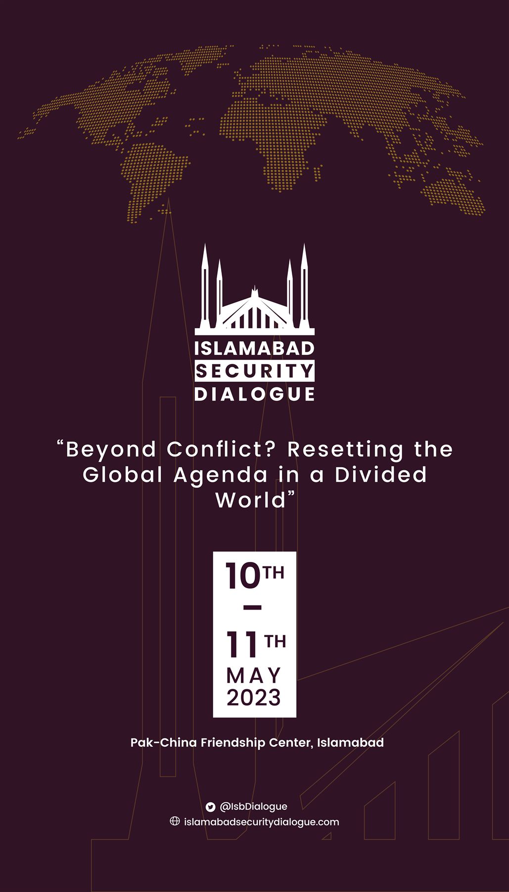
Visual identity for a high-profile international government event — National Security Division, Pakistan.
Case Study
Environmental safety campaign materials for CIT Group in Al Ula, Saudi Arabia.
Case Study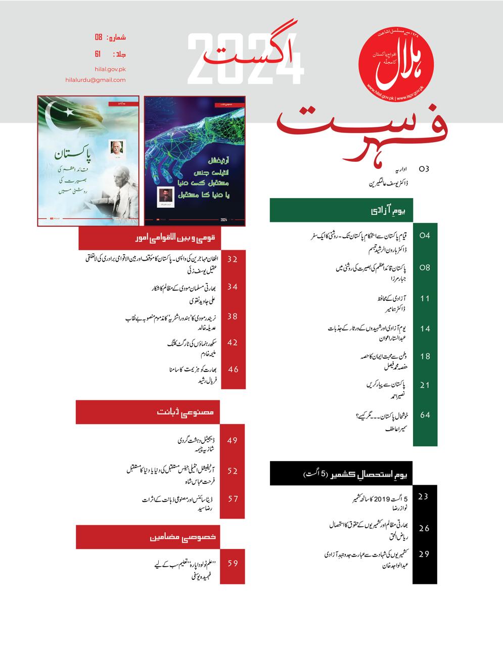
Editorial layout and visual design for Hilal & ISPR magazines, enhancing visual appeal and readability.
Case Study
Visual storytelling and book launch campaign design for IMC and UNDP, ensuring cohesive brand consistency.
Case Study
WordPress website design and development increasing site traffic by 15%, with improved UX and visual identity.
Case Study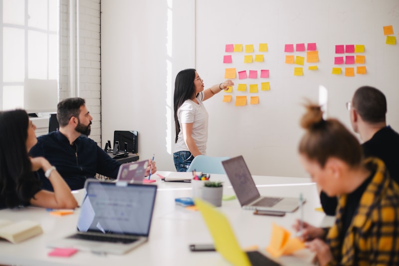
Branding and marketing assets for 10+ corporate events across print and digital channels for international clients.
Case Study
Strategic social media content creation and campaigns resulting in 10% engagement growth at The Crew.
Case StudyDetailed Case Studies
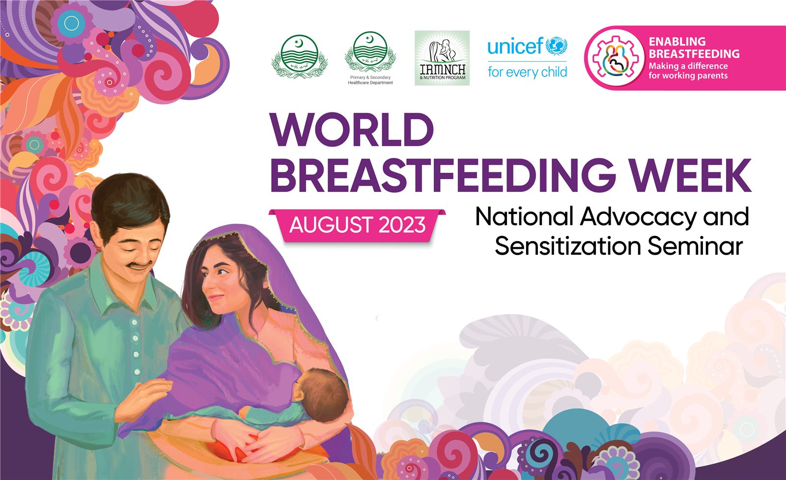
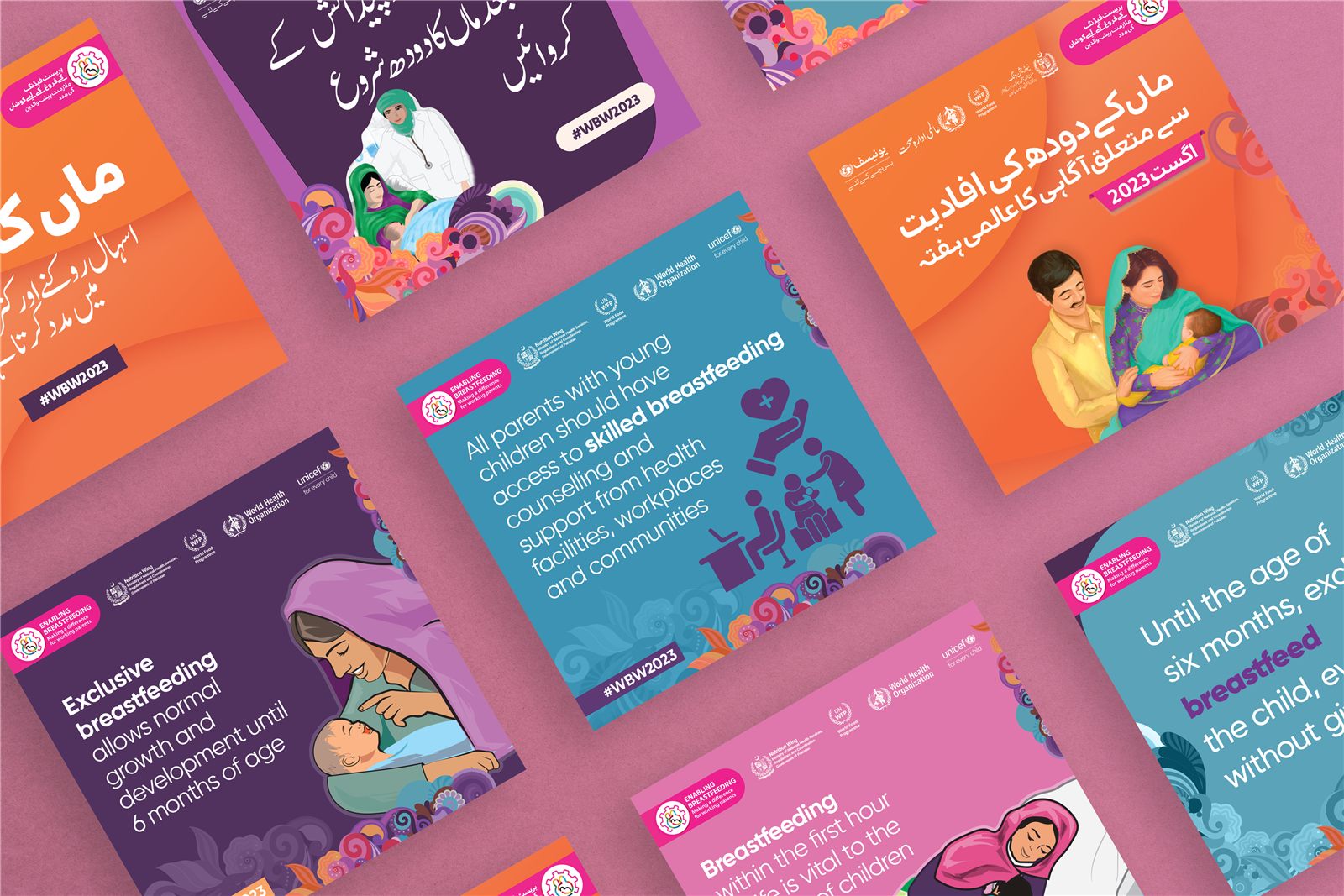
UNICEF Pakistan commissioned an awareness campaign for World Breastfeeding Week 2023, targeting low-literacy communities across Pakistan. As lead designer, I created the full visual system and all campaign materials for print, events, and social media — in three languages.
The core challenge was communicating the importance of breastfeeding and maternal health to audiences with low or no literacy, spread across regions with different local languages. The campaign needed to work for people who could not read at all, while remaining accurate and trustworthy for institutional partners.
Objectives: Explain why breastfeeding is essential for child development; emphasise the impact of a mother's health and wellbeing on breastfeeding; and design materials that could be understood quickly through visuals, not just text.
A vibrant, illustrative style combining icons, simplified figures, and real-life photography to communicate key messages without relying on long copy — legible at a glance.
All key assets designed in three languages on a consistent grid, so typography could change while the visual structure stayed stable. Close collaboration with UNICEF and local partners ensured language accuracy and cultural sensitivity.
Illustrations combined with authentic photos of mothers and babies in everyday contexts, to build trust while keeping the campaign emotionally engaging.
Campaign key visual and layout system, posters and leaflets, roll-up banners for events, digital and social media graphics, and stationery for on-ground activations.
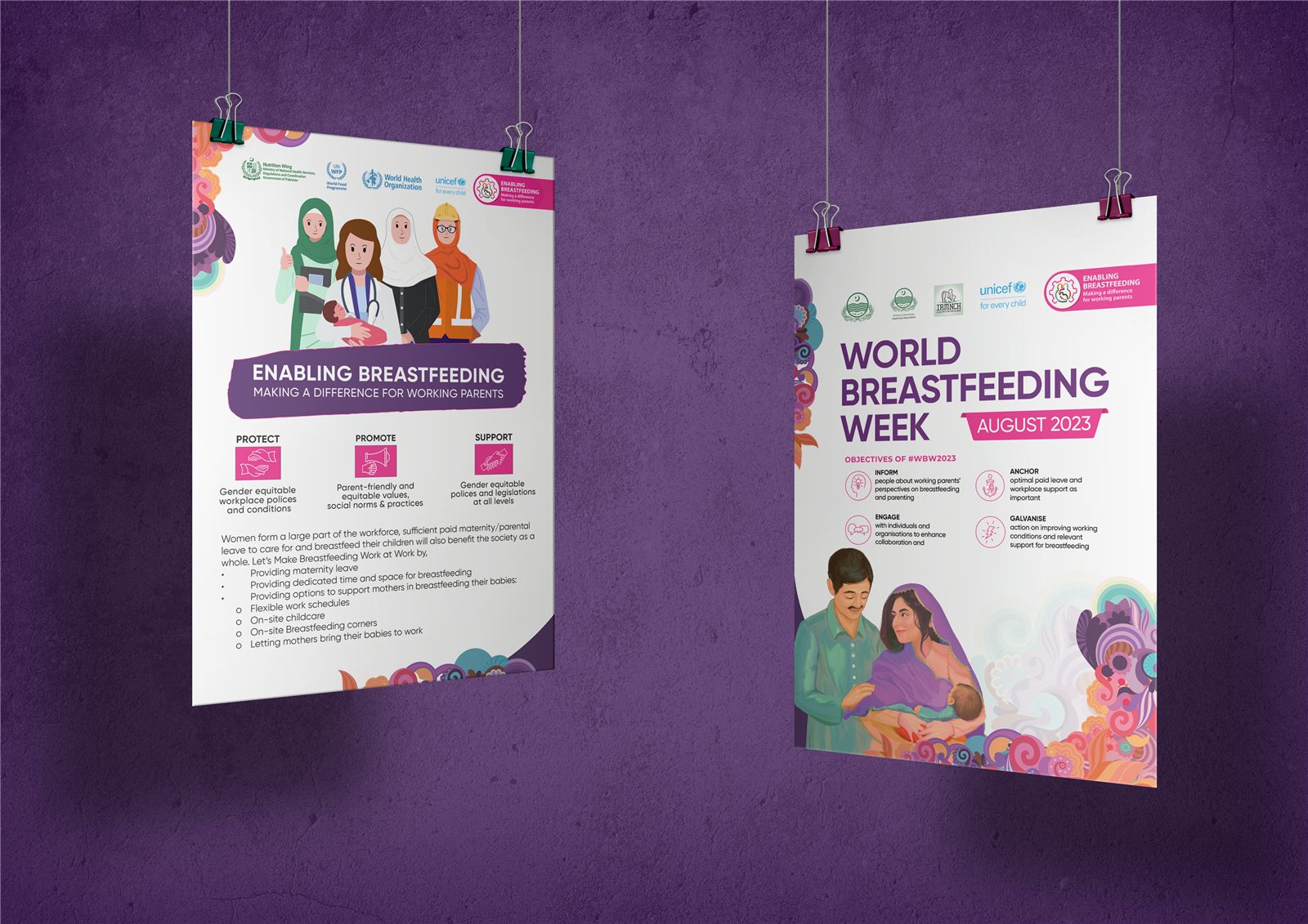
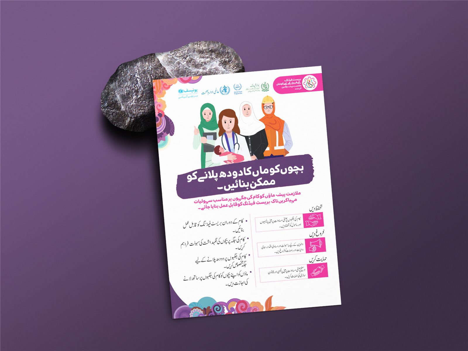
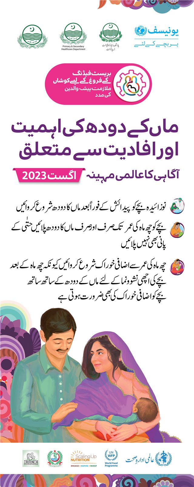

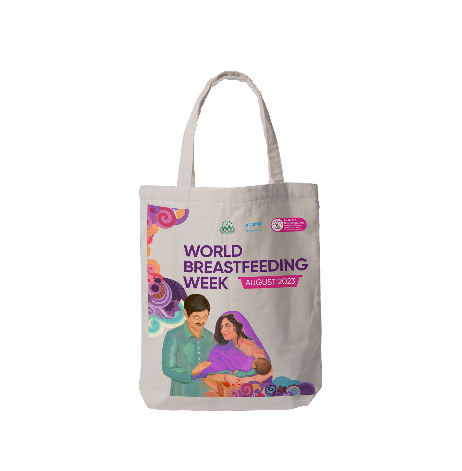
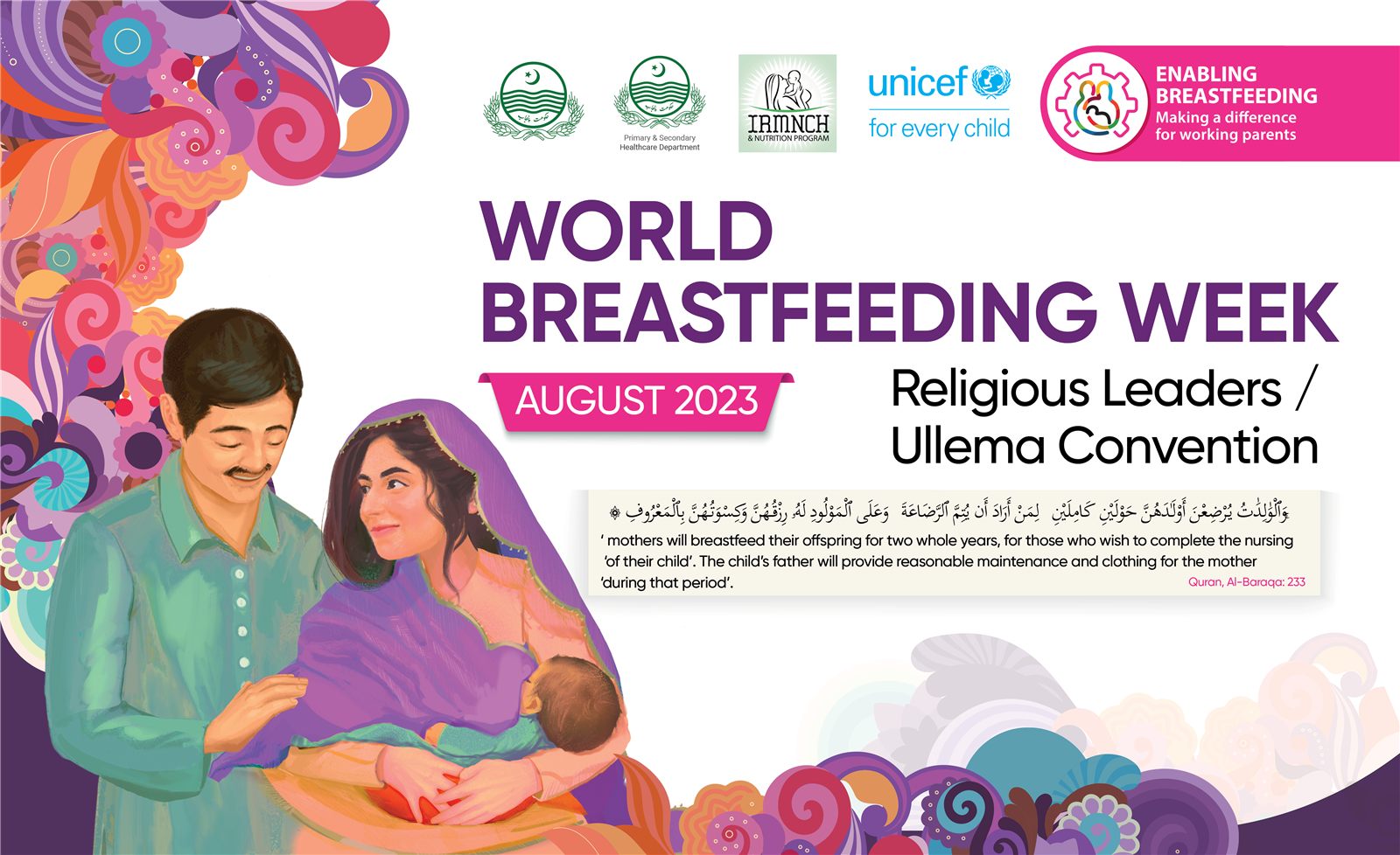
The final campaign provided a coherent visual language deployed across print, events, and digital channels in three languages. Client feedback highlighted that the strong visuals and human imagery helped make complex health messages more accessible in far-flung, low-literacy areas.
My contribution: I was responsible for the full visual direction and production of all campaign assets, from initial concepts to final artwork in multiple languages — strengthening my skills in social impact design, multilingual layouts, and designing for audiences with diverse literacy levels.
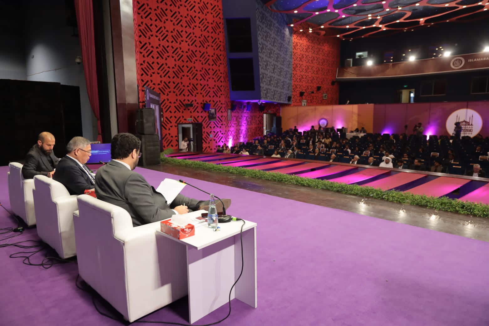
The Islamabad Security Dialogue is a high-profile annual international forum organized by the National Security Division of Pakistan. The challenge was to create a sophisticated visual identity system that communicated gravitas, international standing, and the importance of the dialogue — worthy of representing Pakistan on the world stage.
I studied reference materials from comparable international security forums (Munich Security Conference, Raisina Dialogue) to understand the visual language of high-level diplomatic events. The design needed to balance national identity with international accessibility — conveying formality without being inaccessible.
Typography choices were critical: the system required a serif that communicated tradition and authority, paired with a sans-serif for digital and wayfinding applications.
Logo system, colour palette, and typographic hierarchy developed to meet government protocol requirements.
Conference programs, banners, delegate credentials, and stage graphics designed for the live event.
Social media graphics, digital banners, and email templates for pre- and post-event communications.
High-quality printed materials including booklets, signage, and branded stationery for delegate packs.
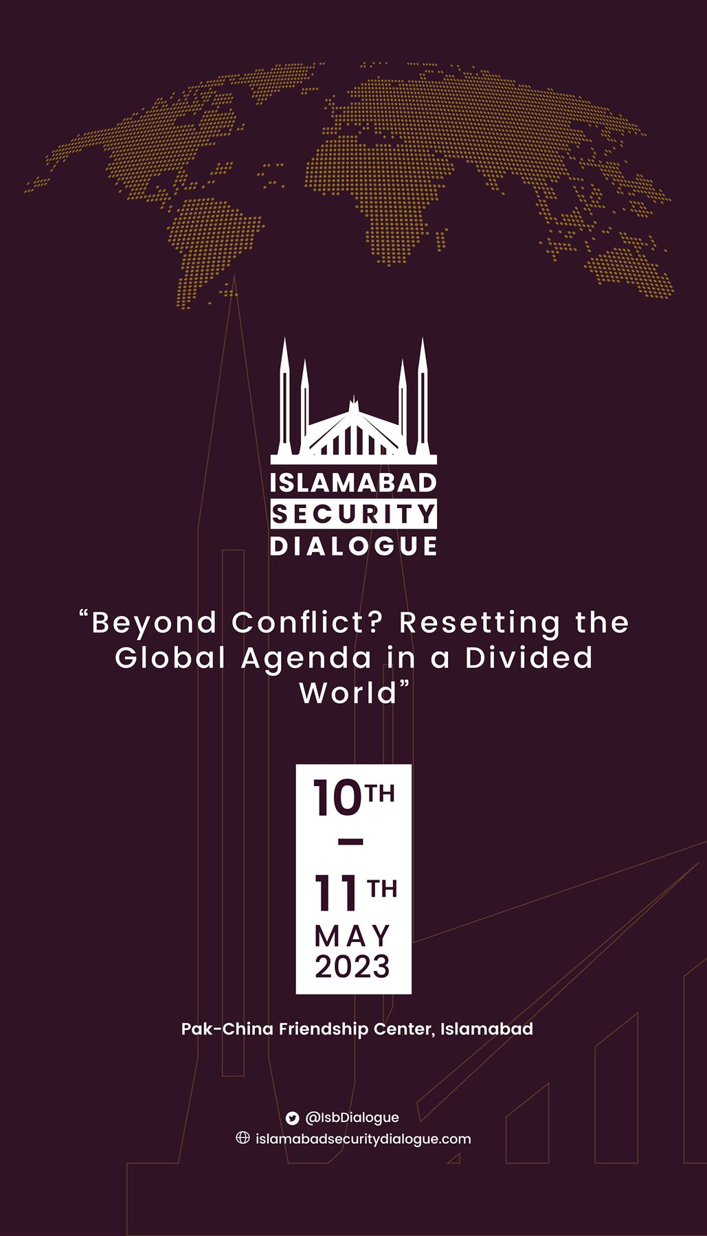
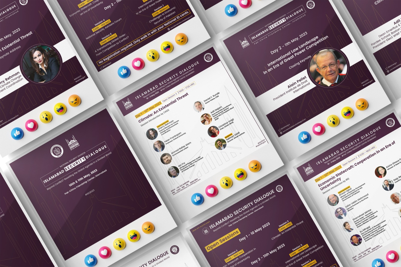
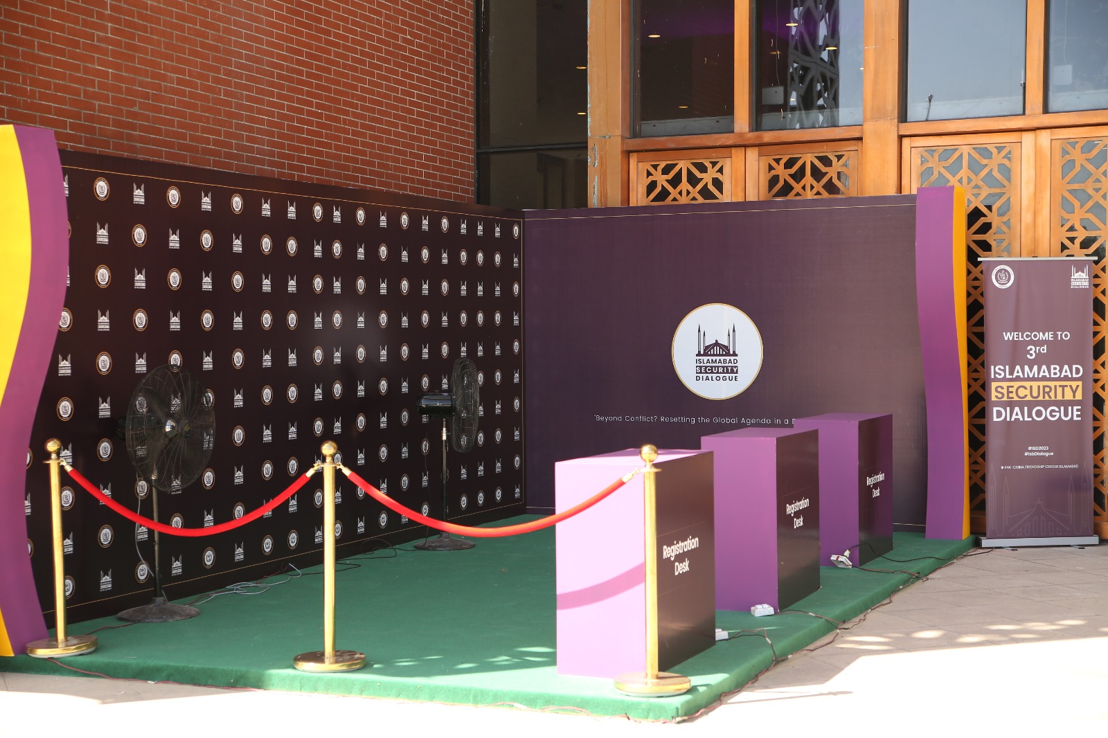
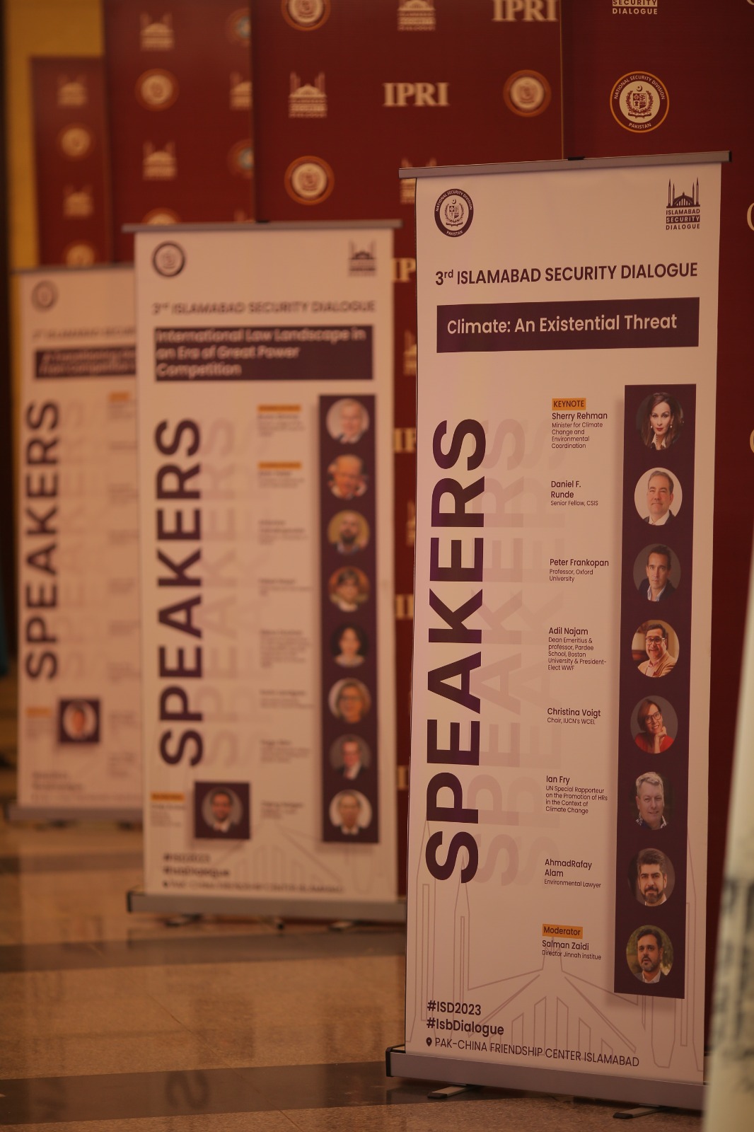
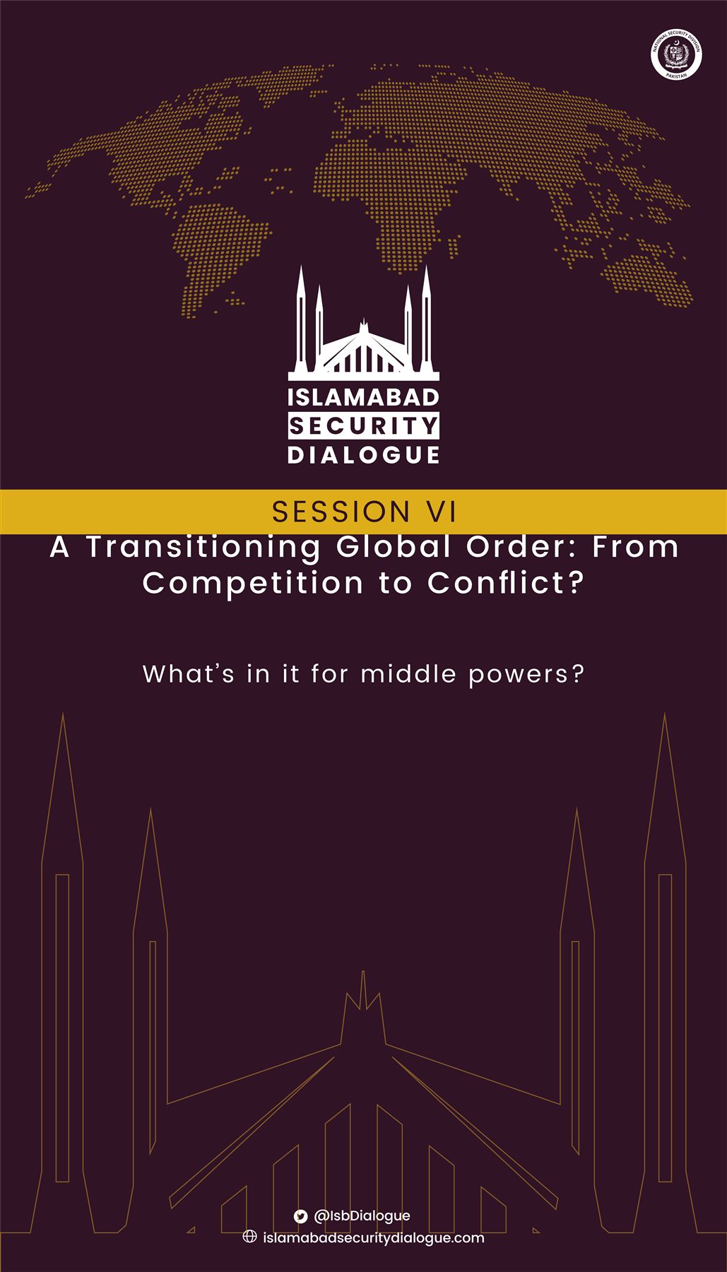
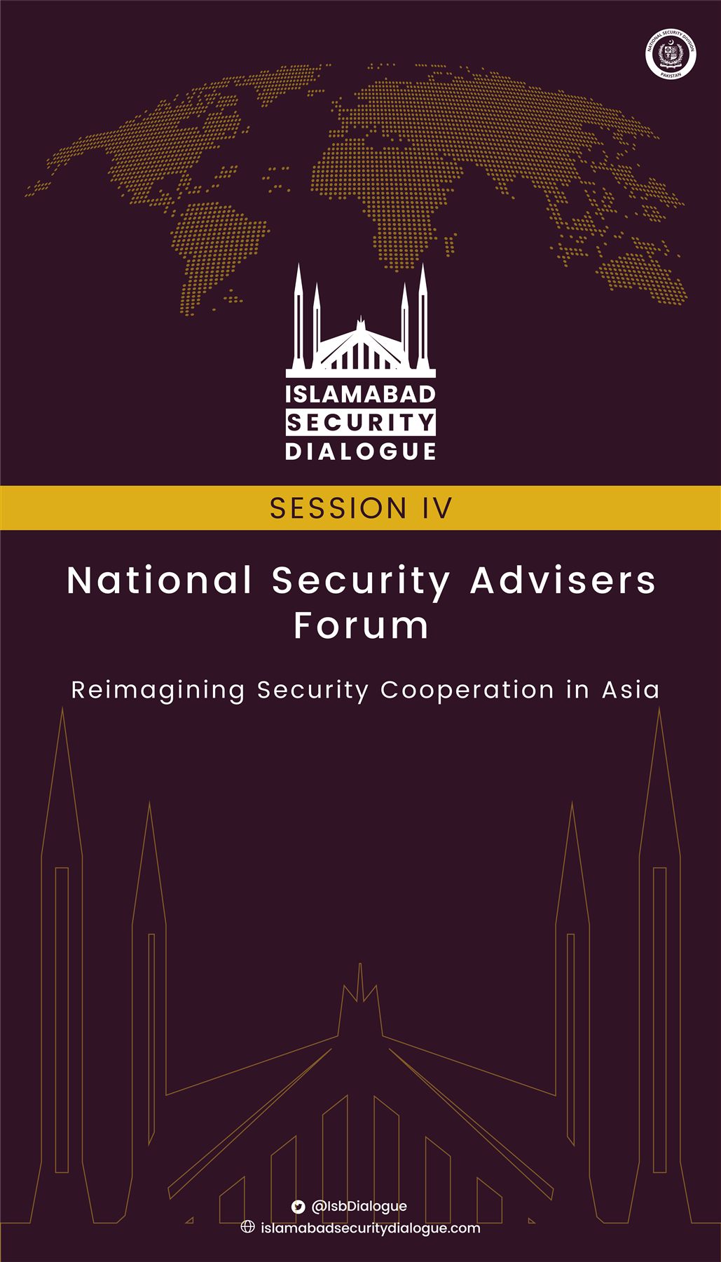
Visual assets and communication materials were deployed across the full event lifecycle — from pre-event promotion to live event signage and post-event reporting. The visual system successfully communicated the prestige of the forum to an international audience of government officials, diplomats, and security experts.

AlUla's Tourism Office identified a growing issue: residents and visitors feeding stray dogs near residential waste bins, which was creating a public health and ecological risk. The project had visibility at ACEO level, with regular progress reviews, and I was brought in to design the public-facing communication.
The brief wasn't just "make a poster" — it needed to work as an on-the-ground behavioral intervention: legible at a glance, clear in Arabic (the primary language of residents), and robust enough to survive revisions from a government stakeholder team with specific brand requirements.
My first proposal treated the bin itself as the message carrier: a secured, lockable trash bin design paired with a bold "Do Not Feed the Dogs" (لا تطعموا الكلاب) mark in Dubai Font, set in black/dark grey for maximum visibility against a no-entry symbol. The idea was to stop the problem at its source — bins that couldn't be easily opened by strays — while carrying the message directly on the object people would encounter.
RCU's team redirected the format: the design needed to work as an A4 flyer for direct distribution to residents, not just as bin signage. They also shared RCU's branding guidelines, approved color coding, and required font — which meant reworking the concept to sit within an existing brand system rather than a freestanding one. Language balance shifted too: Arabic-led, with minimal English.
The second round of feedback asked for the message to go beyond prohibition into explanation — giving residents a reason to change behavior, not just an instruction. I added supporting copy covering:
• Attracting more stray animals
• Risk of disease transmission to humans
• Insect and pest proliferation
• Disruption of ecological balance
• Strays encroaching into residential areas
This is the piece that elevated it from a warning sign to genuine public awareness material.
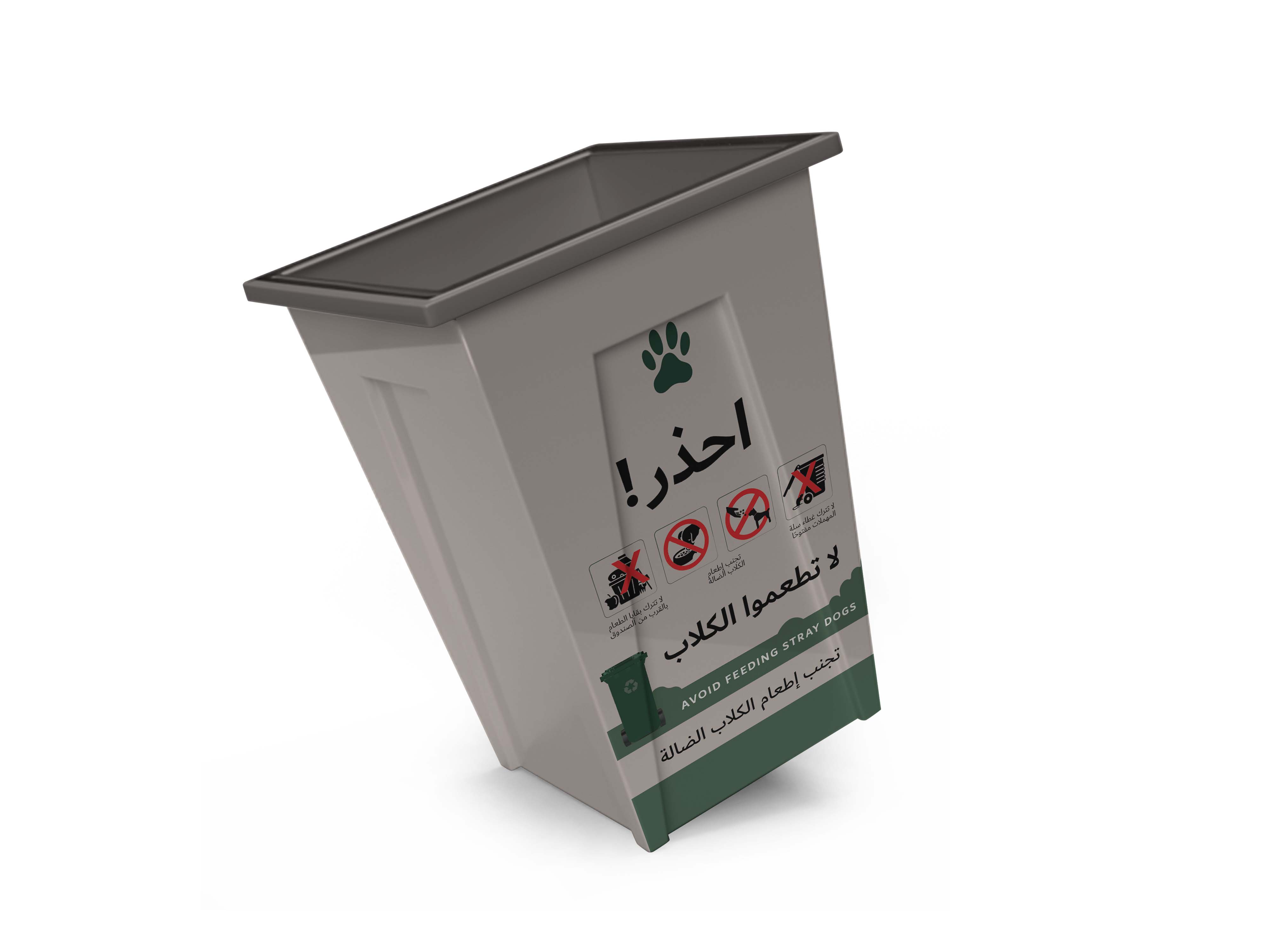
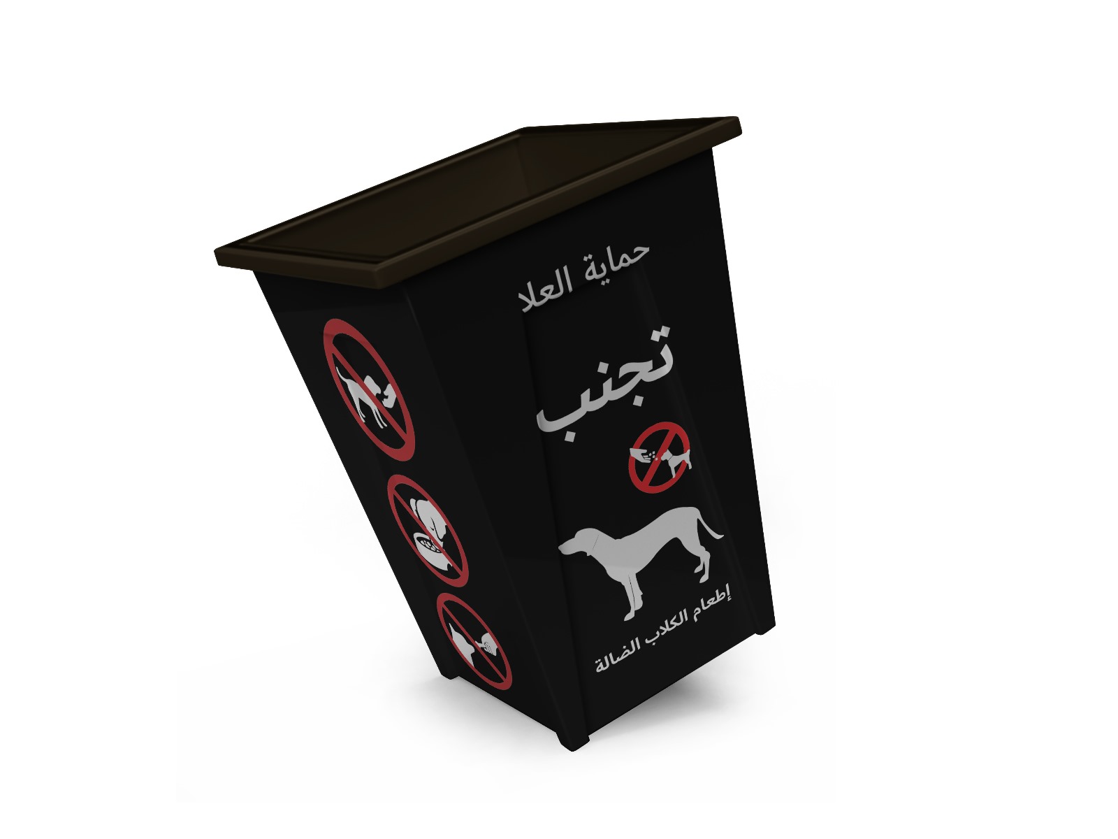
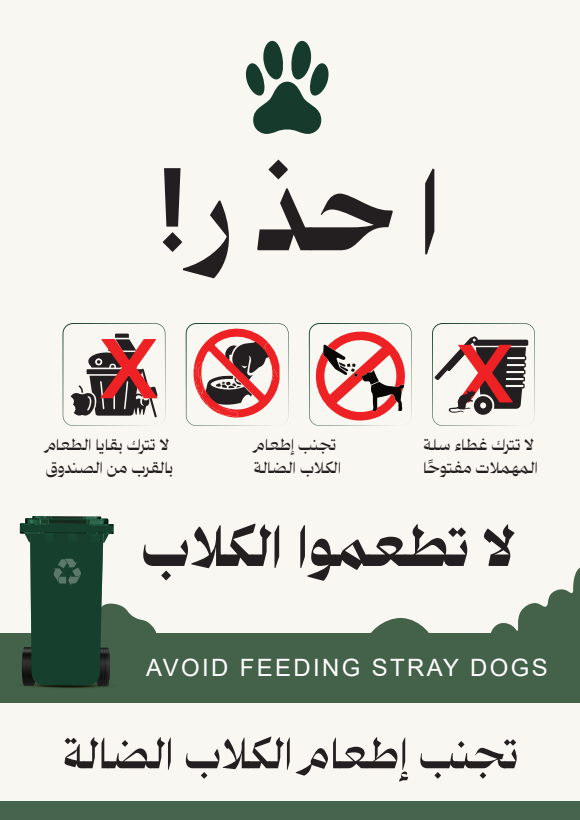
The final system carried a consistent visual language — rounded card format, bold Arabic headline, red prohibition iconography, thin divider rules, bilingual micro-captions — across multiple formats:
• A4 resident flyers, RCU-brand-compliant
• Bin-topic signage (e.g. "don't leave bin lids open," "don't leave food scraps near bins")
• Bin wrap mockups in two colorways (green/beige and black), extending the message onto the physical object itself, anchored by a recurring paw-print mark
Hilal is Pakistan's oldest and best-known defence and current-affairs magazine, published by ISPR (Inter-Services Public Relations). I contributed layout and visual design across regular monthly issues — including theme-led editions such as the August 2024 Independence Day issue — balancing dense editorial content in Urdu and English with a clear, navigable reading experience.
A consistent underlying grid for contents pages, mastheads, and feature spreads kept a large volume of monthly content organised and easy to scan.
Layouts accommodated both Urdu (right-to-left, nastaliq-influenced display type) and English copy, balancing hierarchy across scripts.
Commemorative issues — such as Independence Day and Youm-e-Istehsal-e-Kashmir — received custom illustrated key art tying national iconography (Minar-e-Pakistan, the flag, historical timelines) to the issue's theme.
Contents & masthead spreads, feature layouts, commemorative cover art, and a Pakistan history timeline infographic spanning 1947 to present.
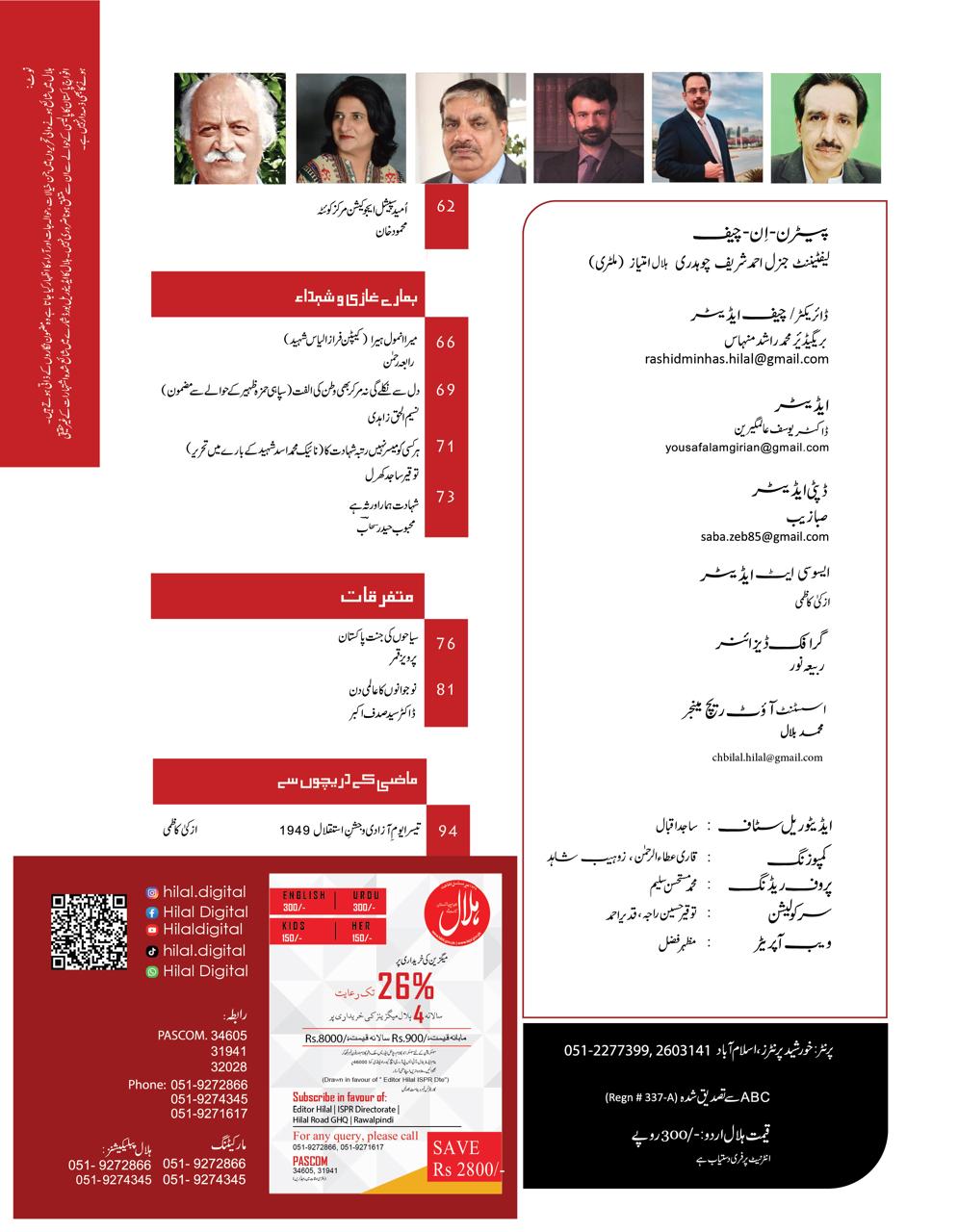
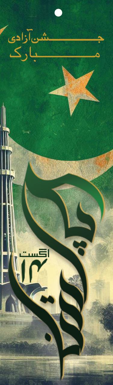
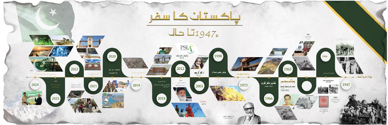
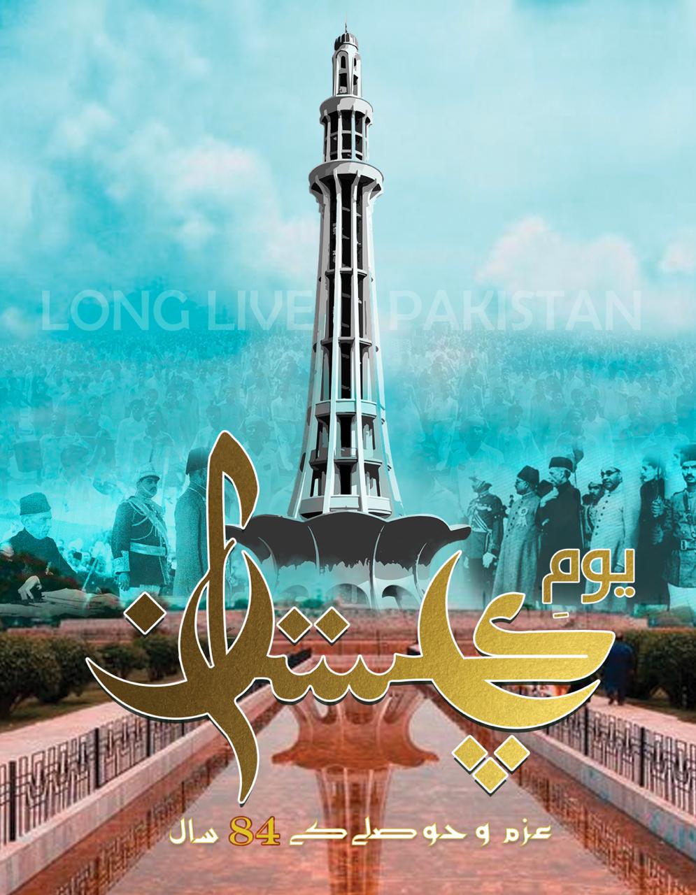
The layouts helped Hilal maintain a consistent, professional editorial identity issue after issue, while still giving commemorative editions room for distinctive visual storytelling — strengthening my skills in long-form editorial systems and bilingual typography.

For book launch campaigns with IMC and UNDP, I designed storyboards and supporting visual materials that carried each publication's narrative from the printed page into launch-event and promotional collateral — covers, invitation and event graphics, and social assets — while keeping every touchpoint on-brand.
The work required translating long-form written content into visual storytelling that could be understood at a glance, ensuring the launch campaigns felt as considered as the publications themselves.

As Digital & Brand Designer at The Crew, I redesigned and rebuilt the company website on WordPress — improving the visual identity, page layout, and overall user experience for visitors. The refreshed site improved navigation clarity and page-level visual consistency across the full site.
Working directly within a UK commercial context, the project balanced brand consistency with practical CMS constraints, giving the internal team full ownership of ongoing content updates after launch.

Across 10+ corporate events for international clients, I designed branding and marketing assets spanning print collateral — banners, signage, and delegate materials — and digital assets for pre- and post-event promotion. Each event required a distinct visual identity delivered consistently across every touchpoint, on tight production timelines.
Social Media
Marketing Initiative
Overview
I led strategic content creation and design for The Crew's social media channels — planning visual content calendars and designing on-brand posts and campaigns. The initiative increased engagement by 10%, strengthening the brand's presence and connection with its audience.